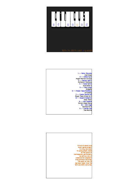
Here is my response to the Circus of Sound brief - we were given this title along with 12 song titles that we had to create a typographic house style to use on a CD cover. The brief was quite loose however and at first I was didn't quite understand it but after trying out one idea and realising it wasn't quite right, I began again with this new design. The second time round was more successful and I am much happier with my design. My first idea included the image of the piano that I've used here but I had it placed onto a photographic background that I took of some autumn leaves. The photo gave it a classic look and it wasn't what I wanted to go for but I hadn't realised this until I had the critque with my classmates. My aim was to give the album cover a young and fresh look because the brief states that this CD was created to bring classic music to younger people. I changed my typeface 'Shark Week' that I had in my orginal design because it was pointed out to me that this choice of font was designed in the 1970's. Not knowing this, I chose it thinking it looked new and fresh and the opposite to classical looking. Now I have chosen a new typeface called 'Neo Gen' that was made this year so I know it is definitely a new font. With my new design I feel I have achieved the aim of the brief as it doesn't look like a typical CD cover that would contain classical music, so I think it would intrigue the eye of a younger audience who hopefully would purchase it.
Tuesday, November 15, 2011
Saturday, November 5, 2011
"Quotes" poster
This is my poster, t-shirt and essay that I designed for the "Quotes" poster project. We were each given a quote that we had to choose a particular typeface for that would describe the quote and the person who said it. My quote was by Noel Coward that reads: 'Extraordinary how potent cheap music is'. Noel Coward was many things in his time including dramatist, actor, writer, composer, lyricist, painter, and wit. It was said that he created the style of 'Englishness' in the 20th century. So Coward would have been a very intelligent and billiant man of his time - the peak of his career being between 1920 and 1930. The typeface I decided to use for this quote was Futura. It was made in 1927 by Paul Renner and it one of the most commonly used typefaces in the world. I thought it was a perfectly apt typeface to use for this project because to the untrained eye it seems like quite a simple sans serif font that is clean and effortless, yet it is very potent in the type world and it is one that continues to be used over and over again by designers everywhere. I think this describes the quote very well as it talks about the 'potent cheap music' so even though it looks simple and easy, it still has a strong impact.
On the day of the class critique, one of my peers mentioned that they thought Futura was perhaps too sophisticated for this quote and maybe it would have been better to use Arial or Times New Roman that match the 'cheap' element. However someone else said that this typeface describes Noel Coward well because he was obviously a well known man of many talents and intellect, so the sophistication of the Futura typeface depicts Coward well. I think I would agree with the second comment and it is one of the reasons that I chose it in the first place.
Subscribe to:
Comments (Atom)


