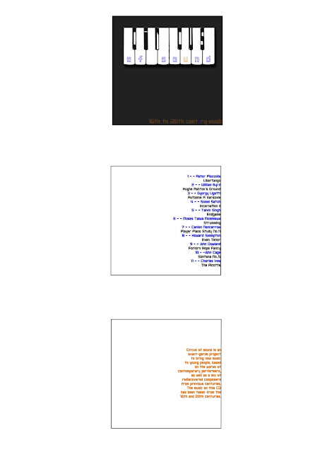
Here is my response to the Circus of Sound brief - we were given this title along with 12 song titles that we had to create a typographic house style to use on a CD cover. The brief was quite loose however and at first I was didn't quite understand it but after trying out one idea and realising it wasn't quite right, I began again with this new design. The second time round was more successful and I am much happier with my design. My first idea included the image of the piano that I've used here but I had it placed onto a photographic background that I took of some autumn leaves. The photo gave it a classic look and it wasn't what I wanted to go for but I hadn't realised this until I had the critque with my classmates. My aim was to give the album cover a young and fresh look because the brief states that this CD was created to bring classic music to younger people. I changed my typeface 'Shark Week' that I had in my orginal design because it was pointed out to me that this choice of font was designed in the 1970's. Not knowing this, I chose it thinking it looked new and fresh and the opposite to classical looking. Now I have chosen a new typeface called 'Neo Gen' that was made this year so I know it is definitely a new font. With my new design I feel I have achieved the aim of the brief as it doesn't look like a typical CD cover that would contain classical music, so I think it would intrigue the eye of a younger audience who hopefully would purchase it.

No comments:
Post a Comment