These are my 8 postcards I made portraying my impression of London. I began my research by photographing a few places in London that I have been before. I found a piece of graffiti I liked when walking around Shoreditch that read 'Home' is a large, fancy typeface. For me, that word summed up my entire impression on London. I have only lived here for a year and a half and I have enjoyed every minute of it, and I feel so comfortable and adjusted to the fast pace London lifestyle that I do in fact feel very much at Home. The colours I have used are various hue's that portray warmth and comfort, but also a vibrancy that describes the words I have used for each postcard; these are 8 reasons why I love living in London. I think that the image I have created using the typography from the photograph now looks like a logo - a logo that represents my impression of London.
Graphic Design 2
Aimee Hooley
Monday, April 23, 2012
Academic Poster
This is a piece of work that I designed for my Understanding Media module. We were asked to design an academic poster based on what we have learned in the module. The content of the poster was of course the most important aspect of the subject; however I was pleased with the aesthetic of the poster as well as the essay within it. I found an image of a blueprint of the Titanic and used this as theme for the overall look. The white text stands out on the blue background in a fresh way rather than simply having black text on a white background. I concentrated on making the text evenly spaced in columns of three and one column was used for the image.
Wednesday, March 21, 2012
What Is Graphic Design?
There was two parts to this brief that required a lot of research and theoretical knowledge on our subject of Graphic Design. Firstly, we each needed to come up with a way of describing what we think Graphic Design is today. I read a few books and some articles on the internet and I came up with a few explanations that made sense to me. I found a few quotes from current Graphic Designers on the subject that I also agreed with. I then had quite a lot of text to play around with to dissect and make one single explanation. I decided that this was too hard so instead I decided to visually communicate all of my thoughts, ideas and quotes that I had found and display it like this:
I realise it is quite tacky as I have copied the layout of Google and simply changed it to Hooley instead as I was asking myself a question that needed answering. However I enjoyed making this anyway and it displays all of my ideas nicely on one page and it is slightly more interesting that a just a boring old essay.
After we figured out the answer to What Is Graphic Design, we then had to create our own project brief that we felt was a description of what Graphic Designers do today. Here is the brief I set myself:
A fundamental element of Graphic Design is to use a visual language to communicate a message, idea or product. For example, the alphabet was created to be used as a form of verbal expression. When producing a piece of graphic design, your visual language should come as naturally as verbal language. As natural as water is on planet earth; water is a fundamental element for the creation of life. For this project you are to re-brand bottled water in a new and fresh approach for the market today. This will include product design, label design and an advertising poster to accompany your new product.
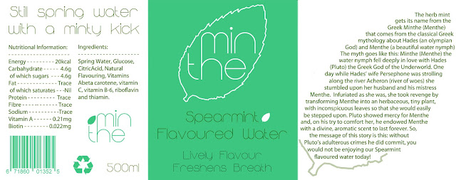
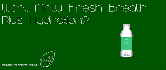
I came up with Minthe Spearmint Flavoured Water. I have always thought there is room in the market for mint flavoured water as I don't think it is very common. I think it is possible to buy this in other countries, and certainly you can buy mint flavoured tea, but not in a cold, bottled version. The USP is that Minthe water freshens your breath as well as hydrates you. I came up with the name Minthe as it is the Greek for 'Mint'. In classical Greek mythology there is a story that includes Hades (the Olympian God) and Menthe (a beautiful Water Nymph). It is a story of how the mint herb came into existence. I explain this story on the label of the product itself as it is very interesting myth and it shows that there is meaning behind the name of this drink. Below is my label design (top) and a poster I created for an Ad on the Tube:
Saturday, March 10, 2012
Mirrors
For our Mirrors brief we were asked to produce a visual description of our home. "Our homes are mirrors of ourselves". I found that the best way to do this was simply by using photography to take pictures of each room in my home in Southampton and produce a book for them. I chose to do this because the brief states that we were to either make a poster, website or a book. I was interested in learning more about book making as I already have the skills and knowledge to produce a poster and I wanted to do something different this time. Each room provides me with different memories, ones that have definitely shaped me as a person today. I love my home and this project was entirely personal to me and I am aware that it wouldn't have much use in the real world, nor would it sell if it was published. However, I have enjoyed completing this project and learning new skills on Adobe InDesign. For my front cover design, I used a photograph of my wall paper in my bedroom that has lovely arabesque detailing. The text is the same colour as the brightest flower on the pattern which has caught the flash of my camera. The font is called Code Bold and there is a lighter version of this which I began to use at first. I soon realised it was too light so I switched to bold, but I left the page numbers in light as they are less important information than the actual text.
Monday, February 27, 2012
A Diaster Waiting to Happen
For this project, the brief asked us to create a piece of graphics with an intention to cause consternation to the public. It would be based upon a global or personal disaster that we could invent ourselves or a non-fictional disaster. To decide whether I wanted to use a non-fictional disaster I read a few newspapers. I came across an interesting article in 'i' newspaper that was a positive article on a new invention called Paul the Robot designed by artist/scientist Patrick Tresset. The article spoke highly of the new intelligent robot that was programmed to be able to complete the same processes humans use when sketching a portrait. The robot isn't typical of fictional robots one sees in the movies (e.g Skynet in The Terminator), it only consists of one arm that is able to hold a biro and a single camera. After reading this I thought I could easily turn this article on its head and make a new newspaper article that would cause worry and a disturbance to those who read it. Instead of a congratulatory story about this new amazing step forward into robotics, I wanted build panic upon the nation that robotic technology keeps progressing into far superior intelligence that us mere human beings and Paul the Robot is just another step towards robots becoming self aware and taking over the world! Obviously the idea was not based on a serious worry of mine that robots might take over the world in the future, but I thought it was an interesting project to work and investigate upon. I created the article for a front page so I thought I would make up a fictional newspaper for my fictional story - the name I gave it was: The Telecommunicator. Quite a long name for a newspaper but so is The Financial Times but that just gets shortened to FT. I have a globe as the logo and I have colour grabbed the section of the sea and used the same blue/green colour as the background for the headline. Headlines are usually in black so I thought I would make my newspaper have its own unique style by having headlines in white text instead. I am happy with my overall design of my newspaper, I think the design is neatly presented and it is more in the style of The Independent rather than a garish newspaper like The Daily Mail.
The second part to this brief was to make an 8 page booklet explaining your disaster. I enjoyed making my booklet because I like writing about my work and being able to explain fully what thoughts I have on my idea and where the idea came from. I styled the booklet to look like an instructional manuel because they usually come with electronical devices so I thought I would create Paul the Robots own manuel.
Monday, January 9, 2012
Brand New
Here is my outcome for the project 'Brand New'. The brief asked us to have an in depth conversation with ourselves about whether or not there is such a thing as a completely new and original idea. I started off looking at a few things and doing some research but I felt I wasn't getting very far with this. I then came up with a better method by seeing what other people thought of this notion. So I decided to create an online survey with 3 fairly simple questions for people to respond to. 40 people answered my questionnaire with quite interesting replies. I wanted to show case all the feedback I got from the questions as they were so fascinating, so I decided to put them together on this information poster along with the two images I featured on the survey. In the centre I placed the 3rd question which simply reads: Do you think there is such a thing as a completely new and original idea? A Yes or No answer was required and 60 percent of the 40 people who answered my questionnaire said yes, they believed there is such a thing as a new idea. The first question was about Andy Warhol's 'Campbell's Soup Can' piece (1964) to see if they regarded this work as fine art or not. The second question was about a piece that I had created by copying a Heinz Cream of Tomato Soup can in the same style as Andy Warhol and I wanted to see what they thought of that too. About 50 per cent of people did see Andy Warhol's piece as fine art, which I was rather surprised at becuase I thought that most people would see him as a pioneer of the fine art world with his Pop Art inspired pieces. More than 50 per cent of people thought that my Heinz Cream of Tomato Soup Can was definitely not an original idea/piece of art work, which was a response I was expecting. I hadn't ever done an online survey before and with the use of Facebook I could send the link to the questionnaire to most of my friends; it was really quite easy to get lots of interesting responses and quickly too. I think this is definitely a method that I will use again to gather fast information on any given topic.
Tuesday, November 15, 2011
Circus Of Sound
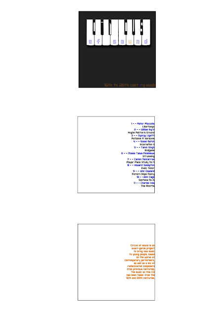
Here is my response to the Circus of Sound brief - we were given this title along with 12 song titles that we had to create a typographic house style to use on a CD cover. The brief was quite loose however and at first I was didn't quite understand it but after trying out one idea and realising it wasn't quite right, I began again with this new design. The second time round was more successful and I am much happier with my design. My first idea included the image of the piano that I've used here but I had it placed onto a photographic background that I took of some autumn leaves. The photo gave it a classic look and it wasn't what I wanted to go for but I hadn't realised this until I had the critque with my classmates. My aim was to give the album cover a young and fresh look because the brief states that this CD was created to bring classic music to younger people. I changed my typeface 'Shark Week' that I had in my orginal design because it was pointed out to me that this choice of font was designed in the 1970's. Not knowing this, I chose it thinking it looked new and fresh and the opposite to classical looking. Now I have chosen a new typeface called 'Neo Gen' that was made this year so I know it is definitely a new font. With my new design I feel I have achieved the aim of the brief as it doesn't look like a typical CD cover that would contain classical music, so I think it would intrigue the eye of a younger audience who hopefully would purchase it.
Subscribe to:
Comments (Atom)


